Hyphen launches full rebrand aligned with new positioning and global strategy

Hyphen launches full rebrand aligned with its new positioning and global strategy
The Portuguese company specialized in UX (User Experience) and Product Design now has a new visual identity, website, and tagline (Connected by Experience), materializing its evolution into a global end-to-end UX partner. The rebrand reflects the ambition to connect people, technology, and business through digital experiences that combine the best of human intelligence and artificial intelligence.
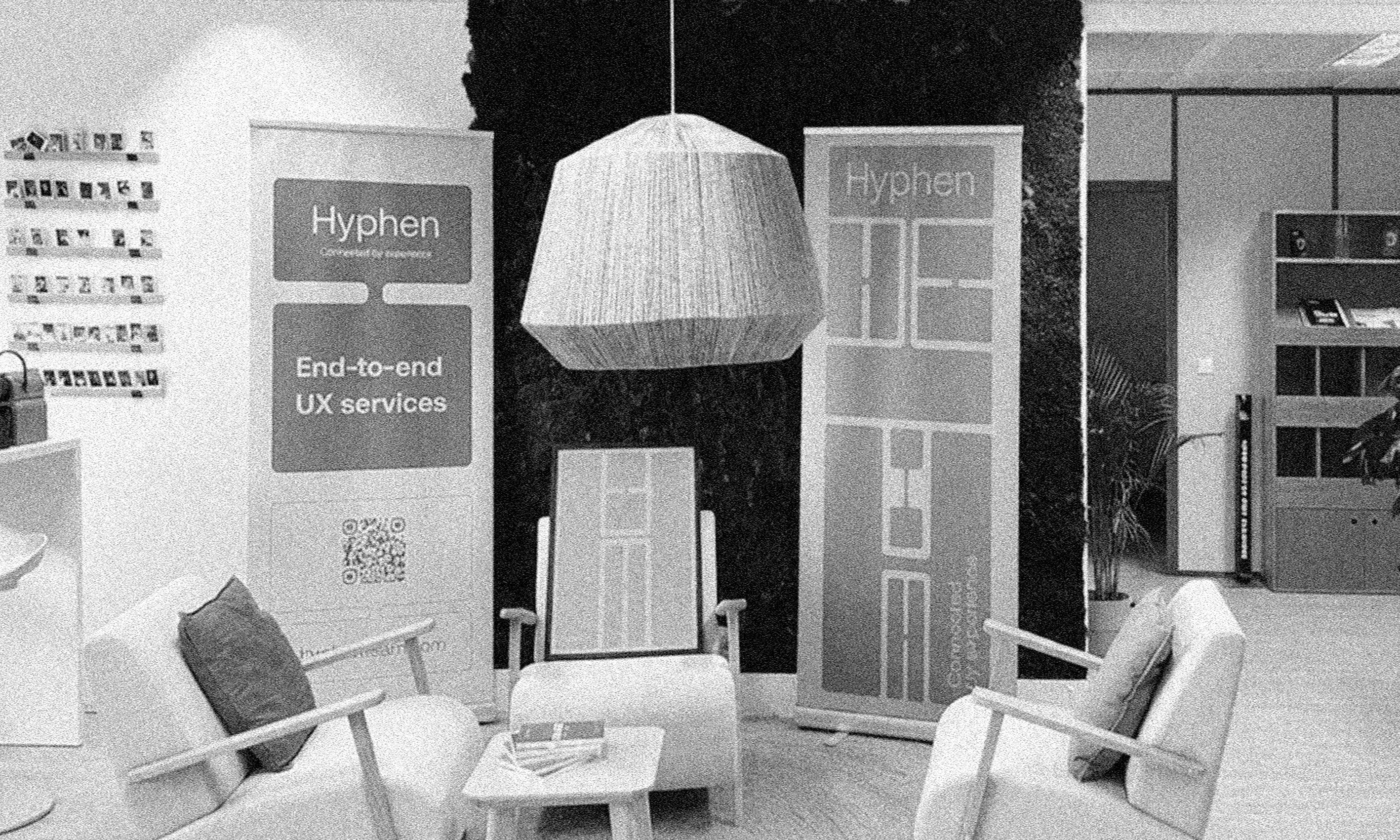
Lisbon, March 3, 2026 – Hyphen, the largest UX company in Portugal, has just launched its new visual identity, website, and claim (Connected by Experience).
The rebrand comes at a moment when Hyphen is already much more than a national UX outsourcing company. In recent months, the company has consolidated a structural transformation: it now offers a complete and integrated global UX offering, with the ability to operate end-to-end through strategic projects, specialized teams, proprietary methodologies, and acceleration powered by Artificial Intelligence.
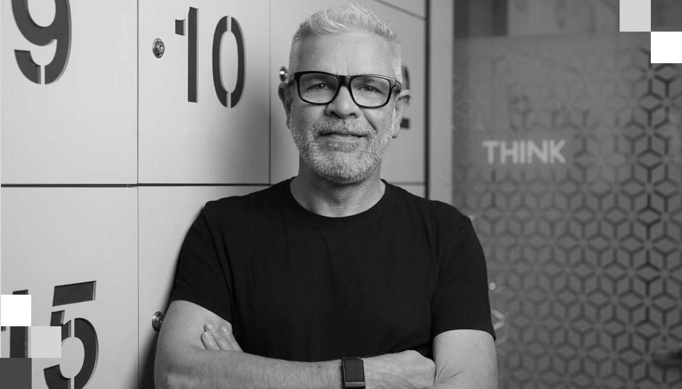
“This rebrand reflects a real transformation at Hyphen. It’s not cosmetic — it’s strategic. The brand now clearly expresses the value we create for our clients: UX as a driver of growth, differentiation, and tangible results. Today we lead end-to-end projects in increasingly demanding and international contexts, always focused on business impact and on the responsibility of using design to improve how people live, work, and interact with the world,” says André Esteves de Carvalho, CEO of Hyphen.
“The new visual identity materializes this new positioning. The brand adopts a personality that is empathic and mature, yet also bold and agile. Empathic because it starts from the premise that, before technology, there are always people: users and clients with their own expectations, emotions, and contexts. Bold because it believes that no complex problem is unsolvable when approached with method, critical thinking, and creativity,” explains Marta Matos, Marketing Director.
The logo adopts more rounded and approachable shapes, reinforcing the human dimension. The balanced typography conveys rigor and professionalism without losing accessibility. The main color (vibrant, warm, and energetic) symbolizes proximity, vitality, and emotional connection.
One of the central elements of the identity is the “H” (or hyphen, depending on how it is represented), explored as a modular graphic device. This element visually represents the idea of connection (two points joined by a common structure), symbolizing the company’s ability to connect people, teams, technology, and business.
“Connected by Experience”: the essence of Hyphen
The new tagline Connected by Experience synthesizes Hyphen’s vision across three levels:
• the connection between people and technology, ensuring that innovation remains understandable, useful, and relevant;
• the connection between talent and organizations, acting as a bridge between highly qualified specialists and demanding digital transformation projects;
• the connection between brands and end users, where experience generates trust, efficiency, and long-lasting relationships.
This tagline also reflects an internal dimension: Hyphen is a community of specialists connected by experience, shared knowledge, and a common vision for the future of digital experiences.
An identity designed for the global stage
The rebrand was conceived from the beginning with international ambition in mind. The visual identity is simple, contemporary, and culturally versatile, avoiding overly local visual codes. English now assumes a central role in brand communication, reinforcing its borderless vocation.
With active projects across Europe, the United States, the Middle East, and Africa, Hyphen positions itself as an international consultancy capable of delivering end-to-end projects, building specialized teams, and operating in complex multicultural environments.
“The rebrand works as a tool for global positioning. We want the brand to clearly communicate our ability to export talent, methodology, strategic vision, and leadership in digital experience,” adds André Esteves de Carvalho.
AI as an accelerator, experience as the differentiator
The new brand also reflects the transformation of UX in a context increasingly influenced by Artificial Intelligence:
• AI as an accelerator for UX work, supporting research, analysis, and iteration with methodological rigor;
• AI integrated into organizations’ UX processes, increasing efficiency and consistency;
• UX for AI-driven products, designing clear, humanized, and transparent experiences that promote trust and user control.
At a time when many organizations focus primarily on technology itself, Hyphen maintains its focus on the human-machine interaction experience, believing that the real value lies in the quality of that relationship.
A rebrand shaped through a long-standing partnership
Hyphen’s rebrand was developed by A Equipa, the creative agency the company has worked with for several years. This partnership has closely followed Hyphen’s evolution, translating its strategic transformation into consistent and high-quality visual and narrative solutions.


.jpeg)